What is cowplot? cowplot is a fun little R package that labels and arranges figures created by ggplot2 into a grid. It also has a nice publication-ready theme for ggplot2 plots. I started using cowplot a few weeks ago and thought I would write a short blog post on the handy features.
For the last few years if I wanted to arrange plots created by ggplot2 into a grid, I would use either the multiplot() function from the Cookbook for R or the arrange_ggplot2() function from Stephen Turner's blog Getting Genetics Done. If I were creating these plots for a publication, I would also want to add labels (e.g. A, B, C, etc) to the arranged plots to be able to refer to individual plots. I would also typically fiddle with the default theme in ggplot2 to remove the default gray background and grid lines (personal preference thing).
Why is it useful? cowplot offers two really cool features:
- The default theme in cowplot has no gray background and no grid lines. It is very similar to ggplot2's theme_classic(), but the main difference is mostly related to the font sizes.
- There are two functions plot_grid() and ggdraw() that allow the user to arrange and label figures in grid. The plots can be arranged according to a specified number of columns (or rows), horizontally (or vertically), and can be labeled.
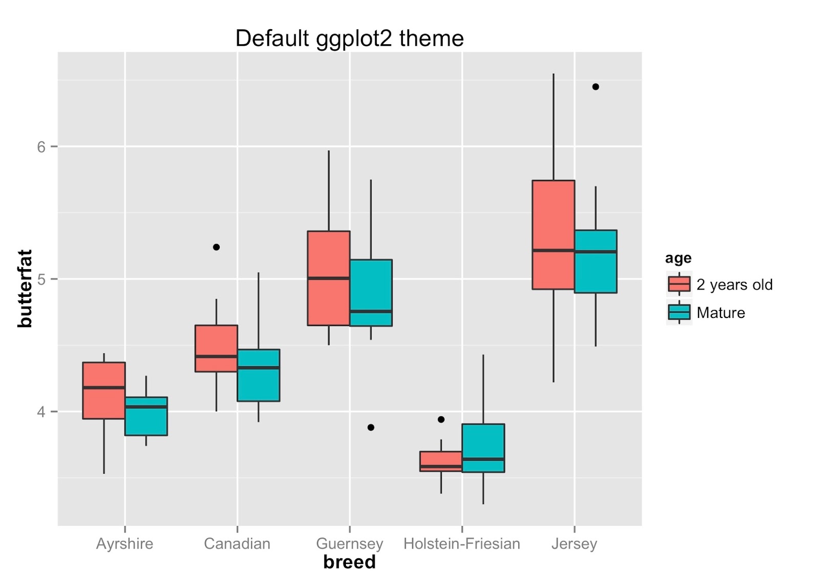
For this blogpost, I found a data set that measures the butterfat content from 100 cows of different breeds and different ages. Very appropriate! :) The data set is located in the PAWSR R package.
Here used ggplot2 to create box plots comparing the butterfat content of the different breeds along the x-axis and colored by the age of the cows. The first set of box plots uses the default cowplot theme. The second uses ggplot2's classic theme and the default theme. To get ggplot2's classic theme and default theme in cowplot, use classic_theme() and theme_gray(), respectively. Notice how the default theme in cowplot does not contain the gray background and gridlines. Also, the color of the axis ticks are black instead of gray the ggplot2 default gray theme.


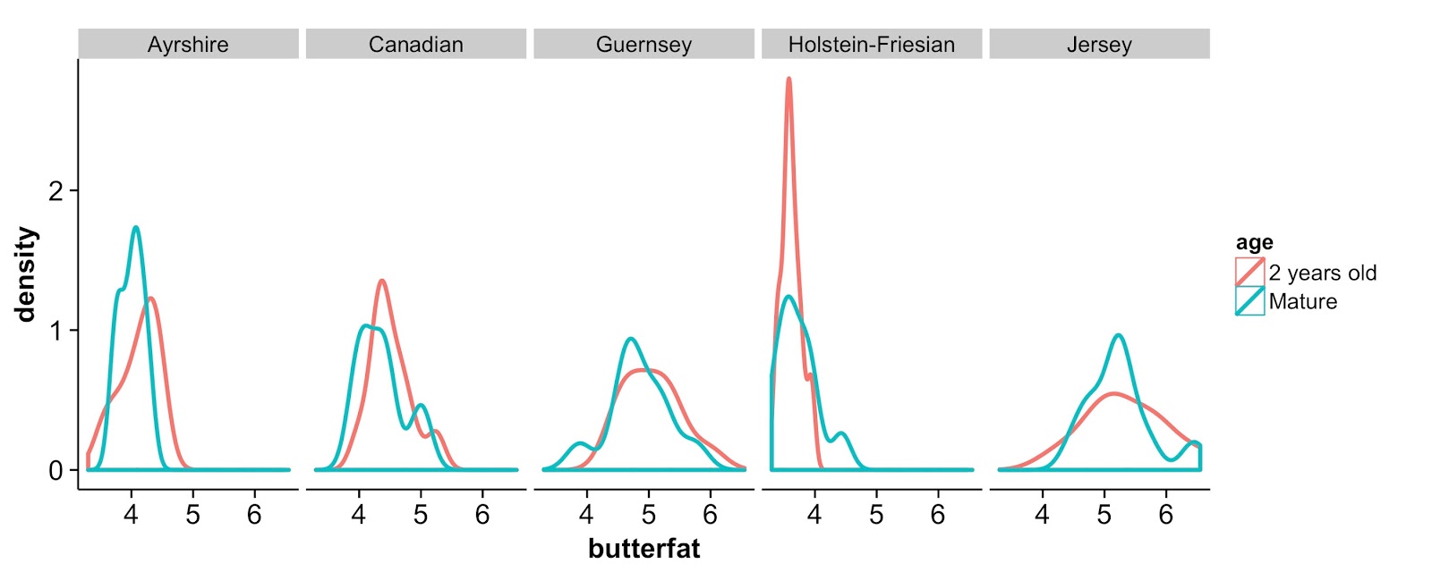
Density plots of the butter fat content colored by age and faceted by breed.
Now, sometimes there is a reason to have the grid lines loaded. In that case, you can use the background_grid() function.

The second thing I really like about cowplot is the built in functions to arrange and label figures in a grid. There are two ways of doing this. The simplest way is to use plot_grid() which takes in a list of ggplot2 plot names and arranges them in a grid according to the specified number of columns (or rows) and how to arrange the plots (vertically or horizontally), etc. You can also provide a set of labels (and label sizes).

Because figure D is more wide than the other three figures, we may want to manually create the grid of plots to be able to specify the width and height of each figure individually. In that case, you want to use the ggdraw() function with the draw_plot() function. The ggdraw() function is the base layer and then you can place individual plots at arbitrary locations using the draw_plot() function.

Good! I was looking for that.
ReplyDelete